p
a
c
t
o
m |
Pac Tom update: Polar adventures in data visualization
(19 Feb 2011 at 23:57) |
For those just joining us, Pac Tom is my now 4½-year project to run the length of every street in Pittsburgh. This update is about a new visualization of the GPS data I collect as part of the project. Behold the most radar-like image ever posted on Tom 7 Radar:
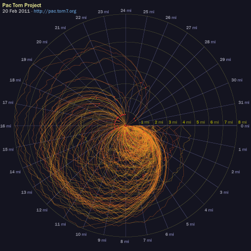
radial.pdf - click to have your face blasted with maths
I'd like to think that my data visualization experiments are self-explanatory, but this one does not have the ability to write or talk so I will do the needful. Each one of the orange lines is a Pac Tom running trip (now a slot-jackpotting 222 of them). The squiggles always start at angle 0, corresponding to 0 miles. They proceed around the radar circle clockwise according to how many Tom-sneaker miles the trip is, with a full revolution being 32 miles. At every point their distance from the center is based on the number of crow-flying miles that I am away from my home, with the outermost circle being 8 miles. Red dot emphasizes the end point. I hope that you appreciate the radial and angular gradations because those were fiddly to make in SVG, particularly the labels.
What can we tell from the graphic? Well, most trips start and end at home. This is obvious from The Rules, which require it. You can see that a bunch of them end about the same distance away; these are all me fizzling out at CMU's campus, where water and HVAC are plentiful, or sometimes where I used to leave my junk. You can also see that there's some consistency to the specifics of the routes both at the beginnings and end (like if you look at those 15–20 mile ones that end at CMU, you see the same jog patterns leading up to those ends, which is me taking the same turn on the way back). There's even a more bold orange laser at the beginning, which basically corresponds to me taking any efficient route away from my house, regardless of where I'm going (it is roughly an Archimedian spiral, where after 5 miles of running I'm about 5 miles away from my house). The most interesting thing to me is that there really is a characteristic shape of a Pac Tom run when plotted this way. A typical runner's route (out and back) would be a prolate ellipsis, actually maybe more like a vesica piscis if the runner gets to the summit overlook or no tresspassing sign or whatever and turns right around. My shorter earlydays runs, which are hard to see because they're all bunched up on top of one another in the South-East octant, are kind of like that actually. But the canonical Pac Tom run now is obovate like a ginkgo leaf, where I run away from home then zig-zag back and forth for many miles, creating the tiny leaf teeth at approximately the same distance, then run back home. There's not even any reason why these would have to be leaf-shaped at all; you can see the few Pittsburgh Marathons in there (those count), which are more like abortive Spirographs.
I had appendix surgery (meaning they just cut it out and threw it in the biohazard) in September and then a work crunch that disrupted my running for a while, but I'm now back to it. I'm getting in decent shape again for the marathon, which I am excited about mostly because of the costume plans. I just polished off large distant neighborhoods Sheraden and Elliott (after a fairly heartbreaking trip where I thought I had at great effort finished, but had missed a tiny 50-foot segment, so I had to go many miles out of my way to get that one yesterday, in really OCD-affirming style. Having done that is actually one of the diagnostic criteria in DSM VII.) and the remaining cleanup to do on the South Side is pretty light and much closer to my home. I think I can be done with those with maybe two months of regular running, and maybe even finish the North Side, which is all that's left, by the end of 2011? 4500 miles in 27 days 15 hours of running, so far. You may track my progress via the graphics at the Pac Tom ultimate cybersite. |  |
|
| Very cool. I couldn't figure out the graph just by looking at it, but some axis labels might've been sufficient. Of course, an interactive flash version where you can hover over each line and see its line, start and stop points highlighted would be pretty sweet also. I'd also like to see a graph showing your speed tracked over miles run. The for the post on the pac.tom7 page seems to be broken. |
| I think I confused "polar" with "lunar" because I was totally expecting there to be a picture of your running routes as seen from the moon. Nevertheless, a unique and fascinating graphic explained with your trademark wry humor (the DSM thing is a joke, right?). |
Scott: Hah, thanks. Yes, it's a joke because they are only up to DSM-IV so far, like DSM-VII is the hypothetical manual I use to diagnose myself as having all sorts of problems like Running OCD and Chronic Nonhoptuitiveness and Telephobia and Catholic Guilt. But I bet I could convince a real doctor of real-style OCD with this project and some carefully chosen answers.
JSS: I want to do all that and more, definitely. But the only thing I have time to do is fix the image on the pac.tom7 page. |
|
|
|
|