p
i
c
t
u
r
e |
CSD Logo Submissions
(07 Sep 2004 at 17:58) |
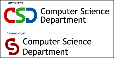 These are the logos I submitted to the competition to select a new logo for the Computer Science Department (CSD). I am actually not that good at making "general purpose" long-term logos, since my style is a bit more whimsical. (But it would be nice to leave some kind of mark on the department, and to help ensure that the logos don't end up being terrible!) Since these will be voted for by a general CS audience, I'm here trying to appeal to geeks by having rotational symmetry (you'll notice both logos are inversions) while not not being totally hideous or inappropriate for printing. Supposedly the whole logo selection process is to be completed by October 1. These are the logos I submitted to the competition to select a new logo for the Computer Science Department (CSD). I am actually not that good at making "general purpose" long-term logos, since my style is a bit more whimsical. (But it would be nice to leave some kind of mark on the department, and to help ensure that the logos don't end up being terrible!) Since these will be voted for by a general CS audience, I'm here trying to appeal to geeks by having rotational symmetry (you'll notice both logos are inversions) while not not being totally hideous or inappropriate for printing. Supposedly the whole logo selection process is to be completed by October 1.
You can check out my submissions here. |
 |
|
| There's a shop near me called "Skate Works" that has its name written star-wars style. |
| I like the University style better, although making the S stand out a little more (different lighter shade) could help i think. The link doesn't seem to work.. |
| I like the star wars one. It looks like a race track with underground tunnel! |
Actually, I guess I should have said "Star Trek" style. Star Wars doesn't have gaps in the letters, it just connects them up.
Mike: I tried coloring the S, but it never looked good around the parts where it 'leaks out'. Anyway, this way is extra abstract, which makes it more of a puzzle, which I hope appeals to geeks. |
| Just make it so jets of flames shoot out the areas where it leaks out. That'll show how hot the CS department is. |
| Man, you are so right. |
| cs is soooooo hot. |
| singes your eyebrows |
| Another vote for "University Style"... |
| oh yeah, I vote "University Style" |
| Le Style de Universidad get's my vote as well. ;-) |
| Thanks guys! But what I really need is for you guys to slip illegitimate ballots into the actual voting round at CMU. |
| Well, "Star Wars" made the short list but not "University". That is a little odd since everyone seems to like U better than SW, including me. Oh well. |
| I think it is too subtle. |
| People will be all like "HUH?????". Remember, the logo has to work for both idiots and savants. |
| Well, it only has to be a recognizable shape! |
So when do you know the outcome?
University has a definite shot in my mind. The second is cool, clever, but there is more of a stretch one would initially have to make first time around; so that means less clarity. Like in writing, right? TV versus lit. But also, it's size... one wants the computer dept[univers.] to have the substance that can be represented by size, more. |
| They were supposed to have selected a logo by october 1. Also, "university style" was not in the list of finalists. |
| Since it's been over a year, I am suspecting this logo drive has been unofficially terminated. I think that's kinda sad. I did spend many hours making these! |
|
|
|