p
e
r
s
o
n
a
l |
Oh by the way my font is on the cover of the new Of Montreal album
(30 Jan 2011 at 11:31) |
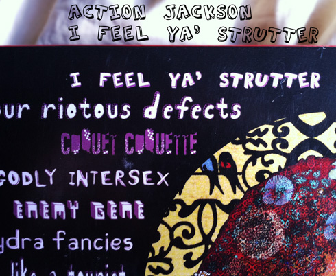
The fonts I made in high school and college show up all over. It means that everywhere I go, some part of my brain is continuously devoted to recognizing these guys anywhere that words appear, sort of like scanning for long missing children in every crowd. Some of my friends have become similarly afflicted, e.g. Nels who spotted them up on the jumbotron and now on the back cover of the new Of Montreal album False Priest: 
What's exciting about this is that this is a band I really like, a quality of a sighting perhaps only matched by Tombats on Adult Swim. This particular design is in the genre "Circus of Bad Typography", though I think it fits in quite well with the artwork, which I like a lot. Mine is the first font up there; I like to think that the designer started by replacing Default Font with mine, and then was inspired like Oh yeah, now I just need to find twelve more amateurish sharewares to complete the look. Though if I were able to pick which song to render in my font, it would be Enemy Gene, Sex Karma, Famine Affair, or Around the Way. Maybe Casualty Of You, though that one seems too uncomfortably scooped by Jeff Buckley's 'So Real' to get my full endorsement. The whole album is quite good, I recommend it.
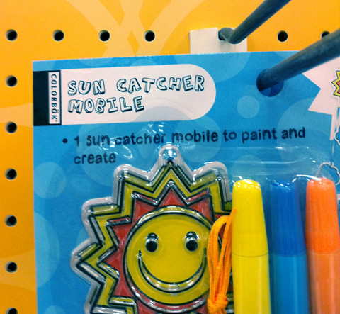
Also bonus nearby photo on my phone, this more average sighting of AJ on a budget toy in Target:  |  |
 |
| oM sweet sighting! |
| that's bloody sweet. these guys are great experimental pop. good job t7. |
 |
|
|
|