|
|
 |
p
e
r
s
o
n
a
l |
November 2011 font sightings
(29 Nov 2011 at 23:23) |
I recognize my fonts like I'd recognize hypothetical children, so imagine my palpitations when I saw one of my hypothetical children hanging out in the battle-ripped warzone of Call Of Duty: Modern Warfare 3:
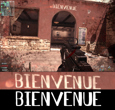
This is from the multiplayer map called "Seatown". The font is Antelope H, which I don't see as often as some others. Not only does this screenshot tell me that I'm LOSING, you can literally see me being shot (screen turns red with pain), holding the starting noob weapon with full ammo, as I do a double-take and capture a screenshot. I was super dead less than a second later. See what you made me do, kids?? Bedtime!!
And speaking of kids, I really like the popular series of videos called Kid History which are stories narrated by kids but acted out by adult humans. (Episodes 1 and 6 are by far my favorites.) I was showing my family these over Thanksgiving break and it continued on to this "Kid Remix" those same guys made, which features Action Jackson in a few scenes:
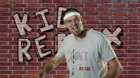
It's not quite a Kid History sighting but close. And while we're on the topic of youtube videos that I really like but that don't actually contain my fonts, I think my all-time favorite is bad lip reading (almost all of them are amazing, but my favorites are Dirty Spaceman and Black Umbrella). Make sure you watch the original videos for the musical ones, to fully appreciate it. |
|
|
p
e
r
s
o
n
a
l |
Oh by the way my font is on the cover of the new Of Montreal album
(30 Jan 2011 at 11:31) |
The fonts I made in high school and college show up all over. It means that everywhere I go, some part of my brain is continuously devoted to recognizing these guys anywhere that words appear, sort of like scanning for long missing children in every crowd. Some of my friends have become similarly afflicted, e.g. Nels who spotted them up on the jumbotron and now on the back cover of the new Of Montreal album False Priest: 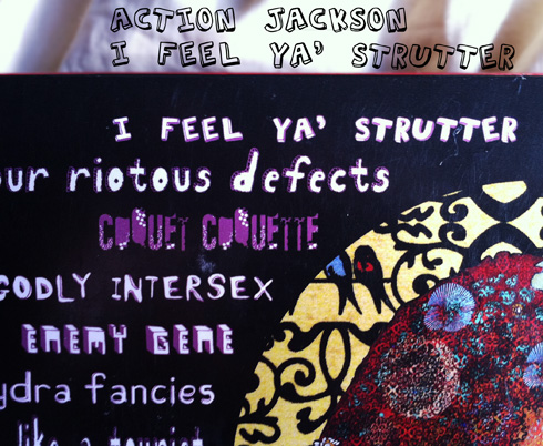
What's exciting about this is that this is a band I really like, a quality of a sighting perhaps only matched by Tombats on Adult Swim. This particular design is in the genre "Circus of Bad Typography", though I think it fits in quite well with the artwork, which I like a lot. Mine is the first font up there; I like to think that the designer started by replacing Default Font with mine, and then was inspired like Oh yeah, now I just need to find twelve more amateurish sharewares to complete the look. Though if I were able to pick which song to render in my font, it would be Enemy Gene, Sex Karma, Famine Affair, or Around the Way. Maybe Casualty Of You, though that one seems too uncomfortably scooped by Jeff Buckley's 'So Real' to get my full endorsement. The whole album is quite good, I recommend it.
Also bonus nearby photo on my phone, this more average sighting of AJ on a budget toy in Target: 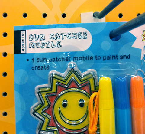 |
|
|
p
e
r
s
o
n
a
l |
Action Jackson MS
(12 Nov 2009 at 09:00) |
It was a special shame/privilege (tried to come up with a good sounding portmanteau expressing this sentiment; failed; any luck?) to find myself looking at cplusplus.com and to see an animated Microsoft Windows VII advertisement that uses my 13 year-old font Action Jackson:
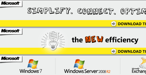
It is truly my most popular child. I looked around: It turns out that the font is actually part of Microsoft's current enterprise software branding campaign "the NEW efficiency". You'll see it in whenever they try to sell their expensive stuff by the hundreds to CTOs; e.g.
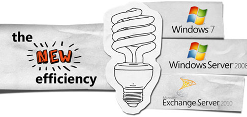
I like to imagine some guys in suits trading whitepapers. The most surreal is their launch event hooha which has extremely boring videos of señor people giving powerpoint presentations which include this branding. For example, join them for the launch event (warning, you need Silverlight and then you gotta wait to download a LOT of this animated lady that's going to be your personal liaison).
(In old, non-ironic sightings news, Tadbot spotted One Constant used on the Scribblenauts site, which game looks awesome.) |
|
|
s
i
g
h
t
i
n
g |
Merry Christmas, Action Jackson
(26 Dec 2008 at 23:28) |
Two independent sightings of my font Action Jackson in the same week! It's having a good Christmas. First Moira sent the following totally sweet Pterodactyl t-shirt on her nephew:
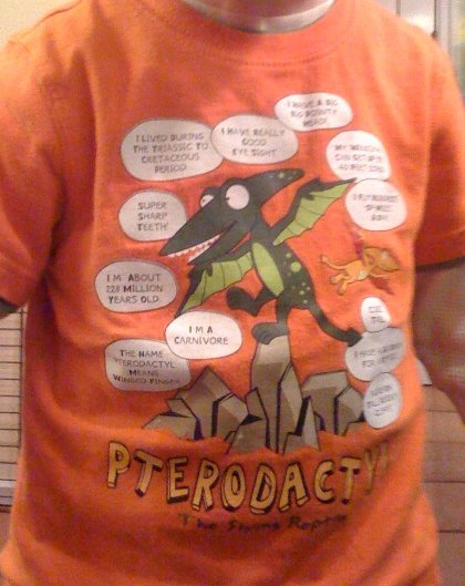
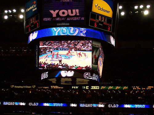
That's my font at the bottom. The shirt looks pretty pro but the hollow insides of the letters are strangely filled in with yellow. I don't really understand how that mistake is possible. Still if they make it in Kid's X-Large I gotta get me one of these. Next Nels spotted and then kindly returned to take photos of the font being used in New Orleans Arena at a Hornets pro-basketball game. Here it is up on the big screen and also scrolling annoyingly in every addressable part of the periphery:
1024×768 version
(It occurs to me that with a name like Action Jackson, the popularity of this font might just be from its abecedarian advantage.) Anyway I love sightings to the max, so please send them if you snag 'em! |
|
|
w
e
b
l
i
n
k |
The good kind of spam
(23 Dec 2005 at 23:14) |
The other day I got what appeared to be an unintelligible foreign-language spam mail, which I just happened to be absentmindedly staring at while I was talking to my officemate william. I was just about to delete it when the text "Tom7's world" somewhere in the body it caught my eye! It turns out this was an entirely topical e-mail alerting me to a Spanish magazine with an "article" about me. The magazine is called Y SIN EMBARGO and I think it is like a design magazine. This specific issue is about graffiti. Anyway, I think it is a really nice looking magazine, it has got my fonts all over it, and the article (which I can't understand, even with Babelfish) seems to be flattering. Some of the graffiti in there is pretty great, too. Their website is confusing and kind of fun to try to navigate, but a direct link to the zipped PDF/ebook may prove useful. (None of the linux PDF readers I had could read this, but Acrobat 6 on Windows seems to work.)
PS. Merry xolidays everyone! |
|
|
u
p
d
a
t
e |
UPD: Hockey is Lif
(18 Jan 2005 at 00:47) |
Due to repeatedly having to see the massive problems in my most recent font Hockey is Lif on Jason's Weblog (as he works his project to 'cool' the font a bit into a sort of monstrous, distended Helvetica), I silently uploaded a new improved version of the font. How uncrapartlike!
In other extended project news, I have been also silently working to add animation and sound to Escape. Sound is about 1% done, but animation is probably at least half done. Be on the lookout for "Beta 2" soon! |
|
|
p
i
c
t
u
r
e |
NEW: Hockey is Lif
(14 Jan 2005 at 19:29) |
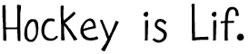 Thanks to fontforge (Fontographer does not run on my computer any more because I have too much memory) I made my first font in three and a half years. It's called Hockey is Lif. (Also, I have restarted the Divide By Zero mailing list from scratch, so if you want to be on it, go there and sign up!) Thanks to fontforge (Fontographer does not run on my computer any more because I have too much memory) I made my first font in three and a half years. It's called Hockey is Lif. (Also, I have restarted the Divide By Zero mailing list from scratch, so if you want to be on it, go there and sign up!) |
|
|
p
i
c
t
u
r
e |
The Most Beautiful Font Ever Constructed
(14 Jan 2005 at 16:49) |
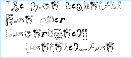 Witness the most beautiful font ever conceived, "Untitled.font." It was created by Adam and Jason and Tom 7 and Heather and Dug and Jeff at D's Six Pax and Dogz on January 13, 2005. Don't delay -- put this in your Windows Microsoft right away. Witness the most beautiful font ever conceived, "Untitled.font." It was created by Adam and Jason and Tom 7 and Heather and Dug and Jeff at D's Six Pax and Dogz on January 13, 2005. Don't delay -- put this in your Windows Microsoft right away. |
|
|
p
i
c
t
u
r
e |
Macworld UK Profile
(27 Aug 2003 at 21:25) |
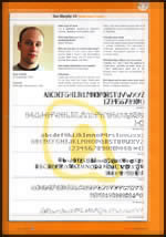
837×1200 version Cool. I have a full-page interview/profile in Macworld UK (the magazine) this month in the article "Takes all types," which is about font designers. Click on the thumbnail to see the scanned page. |
|
|
p
i
c
t
u
r
e |
Tombats on Adult Swim
(29 May 2003 at 08:28) |
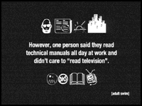
640×480 version My fonts have appeared on TV again, this time on the only show I watch any more, Cartoon Network's Adult Swim! Here, most of the drawings surrounding the text are from my Tombats series. The screengrab was caught by the ever vigilant fast fingers of inpheaux skifyre, just like the time tetanus was on CNN. |
|
|
|
|